Chapter 8 Interactive visualisation
8.1 Interactive apps with plotly
The plotly package can be used for creating interactive web graphics via the open source JavaScript graphing library plotly.js.
library("plotly")
p <- ggplot(data = crcdf,
            aes(x = A1AG2, y = AFM, colour = Group)) +
    geom_point()
ggplotly(p)
crcdf <- crcdf[c(1:10, 191:200), c(70:74)]
x <- gather(crcdf,
key = Protein, value = x,
-Sample,
-Group)
p <- ggplot(data = x,
aes(x = Sample, y = x,
group = Protein,
colour = Protein)) +
geom_line()
ggplotly(p)Two examples using MS data
library("MSnbase")
data(itraqdata)
ms2 <- plot(itraqdata[[1]], full = TRUE)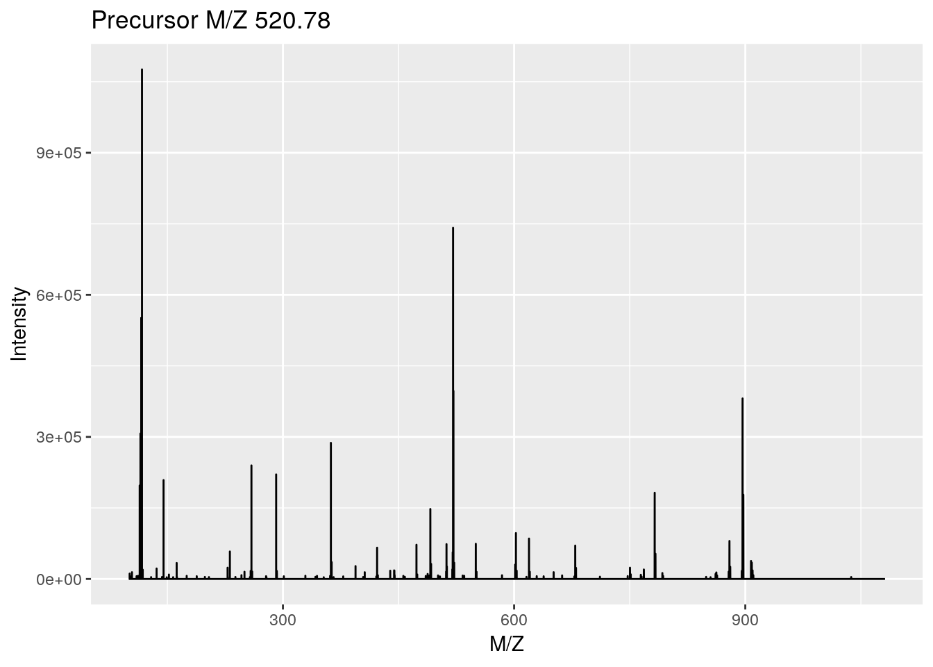
ggplotly(ms2) ## zoom in on iTRAQ4 reporter ionslibrary("msdata")
f <- proteomics(full.names = TRUE, pattern = "TMT11")
rw <- readMSData(f, mode = "onDisk")
ms1 <- plot(rw[[1]])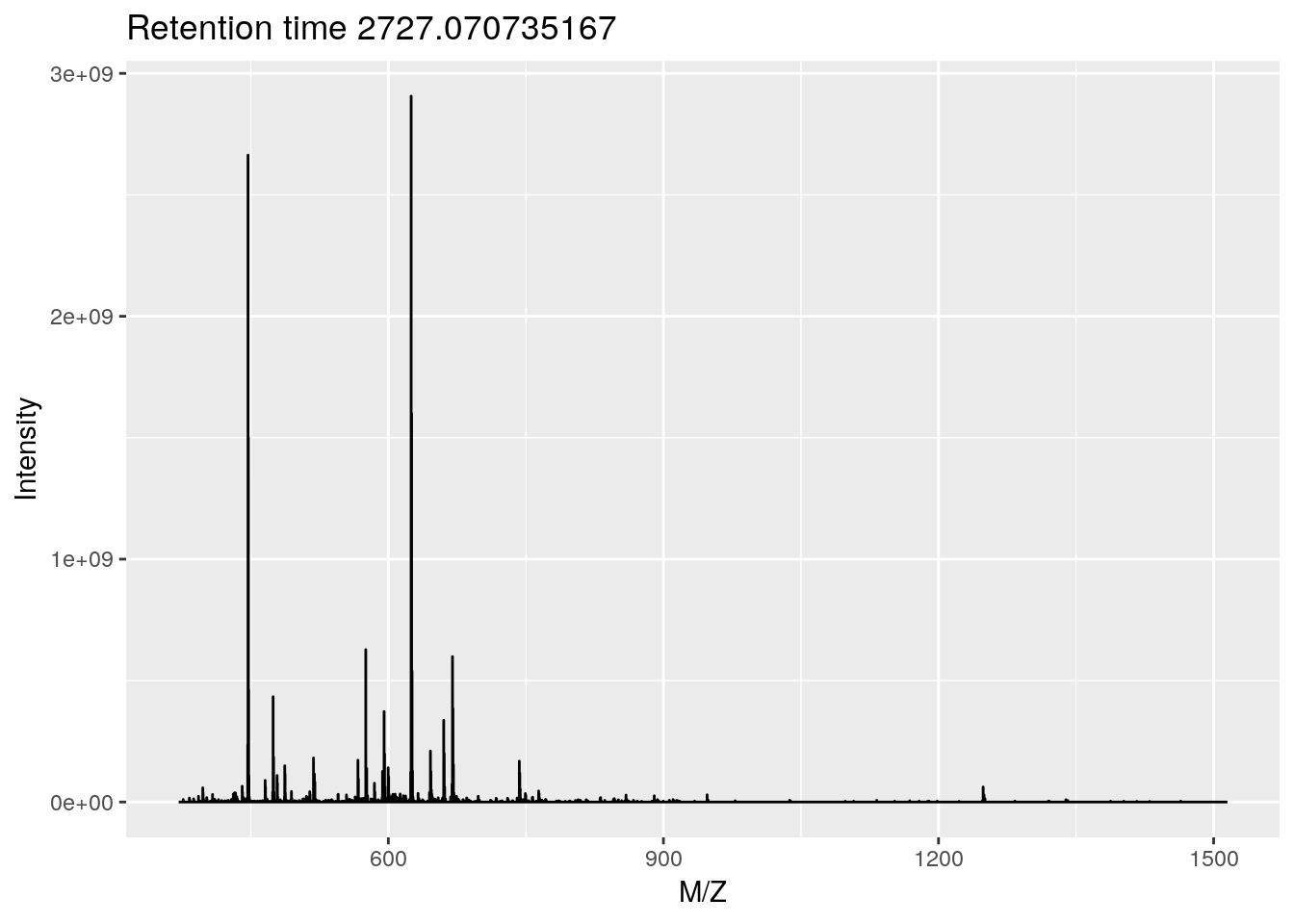
ggplotly(ms1) ## zoom in on isotopic envelopeSee the plotly for R book for more details.
8.2 Interactive apps
8.2.1 Motivating examples
In this section, we show how to build interactive shiny applications. shiny is widely used to explore and visualise biomolecular data. As motivating examples, we present here two such example for proteomics data.
Longitudinal proteomics QC
MSstatsQC uses control charts to monitor the instrument performance by tracking system suitability metrics including total peak area, retention time and full width at half maximum (FWHM) and peak assymetry. Additional metrics can also be analyzed by including them to the input file.
An online application is available at https://eralpdogu.shinyapps.io/msstatsqc
Spatial proteomics
The pRoloc package offers dedicated functionality to manipulate, annotate, analyse and visualise spatial proteomics data. Its companion package pRolocGUI offers support for interactive visualisation.
You can start an app to visualise one of the published data as shown below
library("pRoloc")
library("pRolocdata")
data(hyperLOPIT2015)
library("pRolocGUI")
pRolocVis(hyperLOPIT2015)
This same data is also available as a standalone on-line application at https://lgatto.shinyapps.io/christoforou2015
Reference:
Gatto L, Breckels LM, Wieczorek S, Burger T, Lilley KS. Mass-spectrometry-based spatial proteomics data analysis using pRoloc and pRolocdata. Bioinformatics. 2014 May 1;30(9):1322-4. doi: 10.1093/bioinformatics/btu013. Epub 2014 Jan 11. PubMed PMID: 24413670; PubMed Central PMCID: PMC3998135.
Breckels LM, Mulvey CM, Lilley KS and Gatto L. A Bioconductor workflow for processing and analysing spatial proteomics data [version 2; peer review: 2 approved]. F1000Research 2018, 5:2926 (https://doi.org/10.12688/f1000research.10411.2)
8.2.2 Introduction
A useful shiny cheet sheet is available here.
This section is based on RStudio
shinytutorials.
From the shiny package website:
Shiny is an R package that makes it easy to build interactive web apps straight from R.
When using shiny, one tends to aim for more complete, long-lasting applications, rather than transient visualisations.
A shiny application is composed of a ui (user interface) and a server that exchange information using a programming paradigm called reactive programming: changes performed by the user to the ui trigger a reaction by the server and the output is updated accordingly.
In the ui: define the components of the user interface (such as page layout, page title, input options and outputs), i.e what the user will see and interact with.
In the server: defines the computations in the R backend.
The reactive programming is implemented through reactive functions, which are functions that are only called when their respective inputs are changed.
An application is run with the
shiny::runApp()function, that takes the directory containing the ui and server as input.
Let’s build a simple example from scratch, step by step. This app, shown below, uses the faithful data, describing the wainting time between eruptions and the duration of the reuption for the Old Faithful geyser in Yellowstone National Park, Wyoming, USA.
head(faithful)## eruptions waiting
## 1 3.600 79
## 2 1.800 54
## 3 3.333 74
## 4 2.283 62
## 5 4.533 85
## 6 2.883 55It shows the distribution of waiting times along a histogram (produced by the hist function) and provides a slider to adjust the number of bins (the breaks argument to hist).
The app can also be opened at https://lgatto.shinyapps.io/shiny-app1/
8.2.3 Creation of our fist shiny app
- Create a directory that will contain the app, such as for example
"shinyapp". - In this directory, create the ui and server files, named
ui.Randserver.R. - In the
ui.Rfile, let’s defines a (fluid) page containing
- a title panel with a page title;
- a layout containing a sidebar and a main panel
library(shiny)

shinyUI(fluidPage(
    titlePanel("My Shiny App"),
    sidebarLayout(
        sidebarPanel(
        ),
        mainPanel(
        )
    )
))- In the
server.Rfile, we define theshinyServerfunction that handles input and ouputs (none at this stage) and the R logic.
library(shiny)

shinyServer(function(input, output) {
})- Let’s now add some items to the ui: a text input widget in the sidebar and a field to hold the text ouput.
library(shiny)

shinyUI(fluidPage(
    titlePanel("My Shiny App"),
    sidebarLayout(
        sidebarPanel(
            textInput("textInput", "Enter text here:")
        ),
        mainPanel(
            textOutput("textOutput")
        )
    )
))- In the
server.Rfile, we add in theshinyServerfunction some R code defining how to manipulate the user-provided text and render it using a shinytextOuput.
library(shiny)

shinyServer(function(input, output) {
    output$textOutput <- renderText(paste("User-entered text: ",
                                          input$textInput))
})- Let’s now add a plot in the main panel in
ui.Rand some code to draw a histogram inserver.R:
library(shiny)

shinyUI(fluidPage(
    titlePanel("My Shiny App"),
    sidebarLayout(
        sidebarPanel(
            textInput("textInput", "Enter text here:")
        ),
        mainPanel(
            textOutput("textOutput"),
            plotOutput("distPlot")
        )
    )
))
library(shiny)
shinyServer(function(input, output) {
output$textOutput <- renderText(paste("User-entered text: ",
input$textInput))
output$distPlot <- renderPlot({
x <- faithful[, 2]
hist(x)
})
})- We want to be able to control the number of breaks used to plot the histograms. We first add a
sliderInputto the ui for the user to specify the number of bins, and then make use of that new input to parametrise the histogram.
library(shiny)

shinyUI(fluidPage(
    titlePanel("My Shiny App"),
    sidebarLayout(
        sidebarPanel(
            textInput("textInput", "Enter text here:"),
            sliderInput("bins",
                        "Number of bins:",
                        min = 1,
                        max = 50,
                        value = 30)
        ),
        mainPanel(
            textOutput("textOutput"),
            plotOutput("distPlot")
        )
    )
))
library(shiny)
shinyServer(function(input, output) {
output$textOutput <- renderText(paste("User-entered text: ",
input$textInput))
output$distPlot <- renderPlot({
x <- faithful[, 2]
bins <- seq(min(x), max(x), length.out = input$bins + 1)
hist(x, breaks = bins)
})
})- The next addition is to add a menu for the user to choose a set of predefined colours (that would be a
selectInput) in theui.Rfile and use that new input to parametrise the colour of the histogramme in theserver.Rfile.
library(shiny)

shinyUI(fluidPage(
    titlePanel("My Shiny App"),
    sidebarLayout(
        sidebarPanel(
            textInput("textInput", "Enter text here:"),
            sliderInput("bins",
                        "Number of bins:",
                        min = 1,
                        max = 50,
                        value = 30),
            selectInput("col", "Select a colour:",
                        choices = c("steelblue", "darkgray", "orange"))
        ),
        mainPanel(
            textOutput("textOutput"),
            plotOutput("distPlot")
        )
    )
))
library(shiny)
shinyServer(function(input, output) {
output$textOutput <- renderText(paste("User-entered text: ",
input$textInput))
output$distPlot <- renderPlot({
x <- faithful[, 2]
bins <- seq(min(x), max(x), length.out = input$bins + 1)
hist(x, breaks = bins, col = input$col)
})
})- The last addition that we want is to visualise the actual data in the main panel. We add a
dataTableOutputinui.Rand generate that table inserver.Rusing arenderDataTablerendering function.
library(shiny)
## Define UI for application that draws a histogram
shinyUI(fluidPage(
    ## Application title
    titlePanel("My Shiny App"),
    ## Sidebar with text, slide bar and menu selection inputs
    sidebarLayout(
        sidebarPanel(
            textInput("textInput", "Enter text here:"),
            sliderInput("bins",
                        "Number of bins:",
                        min = 1,
                        max = 50,
                        value = 30),
            selectInput("col", "Select a colour:",
                        choices = c("steelblue", "darkgray", "orange"))
        ),
        ## Main panel showing user-entered text, a reactive plot and a
        ## dynamic table
        mainPanel(
            textOutput("textOutput"),
            plotOutput("distPlot"),
            dataTableOutput("dataTable")
        )
    )
))
library(shiny)
## Define server logic
shinyServer(function(input, output) {
output$textOutput <- renderText(paste("User-entered text: ",
input$textInput))
## Expression that generates a histogram. The expression is
## wrapped in a call to renderPlot to indicate that:
##
## 1) It is "reactive" and therefore should be automatically
## re-executed when inputs change
## 2) Its output type is a plot
output$distPlot <- renderPlot({
x <- faithful[, 2] ## Old Faithful Geyser data
bins <- seq(min(x), max(x), length.out = input$bins + 1)
## draw the histogram with the specified number of bins
hist(x, breaks = bins, col = input$col, border = 'white')
})
output$dataTable <- renderDataTable(faithful)
})Challenge
Write and your
shinyappapplications, as described above.
Single-file app
Instead of defining the ui and server in their respective files, they can be combined into list
ui <- fluidPage(...)
server <- function(input, output) { ... }
To be run as
shinyApp(ui = ui, server = server)Challenges
Create an app to visualise the
mulvey2015normdata where the user can select along which features to view the data.As above, where the visualisation is a PCA plot and the user chooses the PCs.